Soccerbible中文站 一旦分享,没有距离。
本站内容由soccerbible全球翻译小组提供,严禁转载,违者必究!
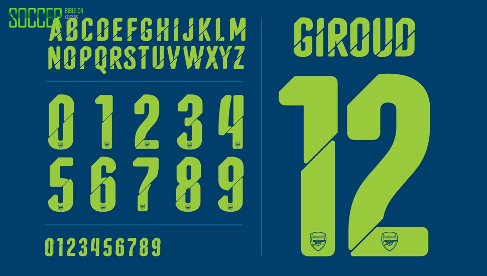
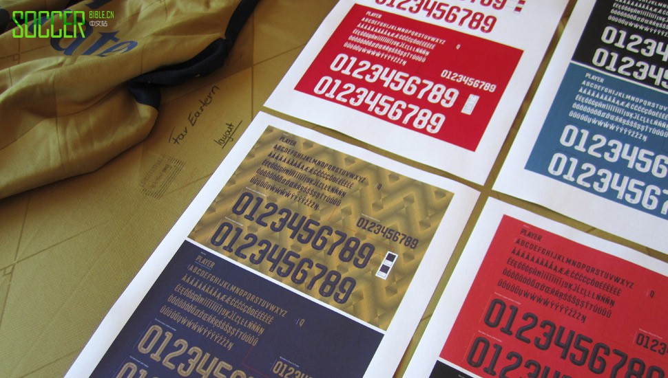
Another contender for the type of the season gong, it's a beautiful addition to the wears that Arsenal will be donning through cup competitions this season. Speaking to Ulrich Planer at PUMA, we were able to delve a little deeper in telling the story behind this stunning and tremendously unique, series of numbers and letters.
Can you tell us about the creative direction for the arsenal font?
In the first season with Arsenal we introduced something completely new to Arsenal. A third shirt with a very striking diagonal graphic. This diagonal language was not only on the front graphic of the jersey, but also within the small heat transfer on the back on all three, home, alternate and third jersey. When looking into the typography, we wanted to continue with this diagonal language by breaking up the numbers.

Do you try and convey the character of a club when designing a font?
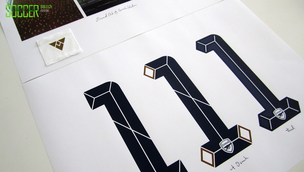
The creative direction for PUMA´s football collection was geometrical shapes. This perfectly matched the Art Deco era of Arsenal. Arsenal pay homage to this era with Herbert Chapman as their manager in their Diamond Club at Emirates Stadium. Our direction with this successful Chapman era was not only combined on the golden alternate shirt, but also extended into the numbers. We incorporated the diamonds into the glyphs and also added a small triangular "A" between the name and the collar.

What did you most enjoy about creating the 15/16 Arsenal type face?
During the design process, we felt that the numbers look a bit too flat. Adding the 3D shadow effect really lifted up the whole typeface. Especially on the golden colourway the numbers look like they are made out of steel or aluminium. We were very happy to add that important final touch.

A well received kit, you can get the 15/16 Arsenal shirt through various online stockists including Pro-Direct Soccer. What about that type? Shout our way in the comments below.