Soccerbible中文站 一旦分享,没有距离。
本站内容由soccerbible全球翻译小组提供,严禁转载,违者必究!
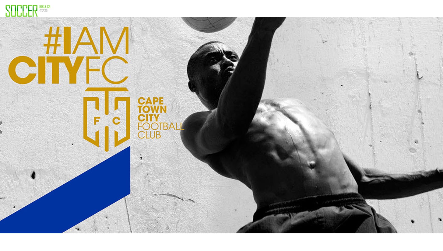
A fresh out the box club that is ready to bolt out of the blocks, Cape Town City FC couldn't ask for a stronger place to start their professional journey. They have joined the South African Premier League having risen from the ashes of the now dissolved Mpumalanga Black Aces F.C. and their house is very much in order. Branded with the 'City' at their core, it's a club on a mission to hit the markers of cool with the snapback at the centre of that story. Making it a place of the people though, it's a collective appreciation they're looking to build here with potential fans helping distinguish what it will mean to be a part of this set up.

Players with calibre signing up and a stadium that played host in the 2010 World Cup, there's a statements of intent all over. Not least with the creative game that has been played out from the off by Cape Town agency 'North Ltd'. Breaking down proceedings the agency describe the project, "A Team For The City, North set about creating an immediately iconic, superbly modern logo which is devoid of any geographical or historical references. It needed a symbol that Capetonians of every walk of life would feel proud to have emblazoned on their shirts, flags and hats. The logo is contained, fresh and incredibly bold and immediately makes CTCFC look like no other team in the country."


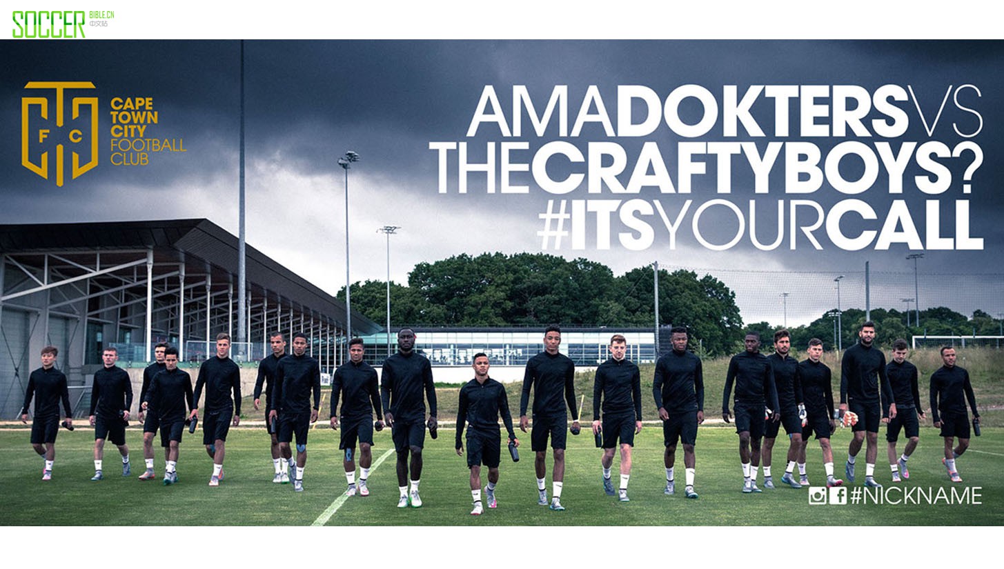
"North didn’t want the team to just look different to everyone else, going forward the challenge will be to act differently to everyone else by engaging with fans across multiple platforms and actually listening to what they have to say. As a departure point for this, North got fans to vote on certain aspects of the club from the away kit design to the clubs new nickname using #itsyourcall."
Sharp all over, you can dive a little deeper into the club here and check out the project North Ltd here.