Soccerbible中文站 一旦分享,没有距离。
本站内容由soccerbible全球翻译小组提供,严禁转载,违者必究!
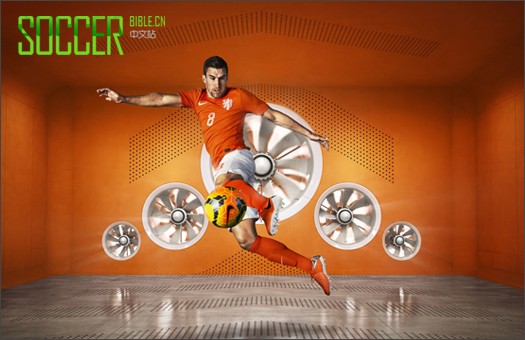
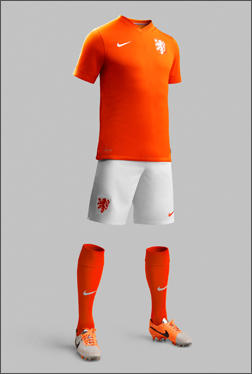
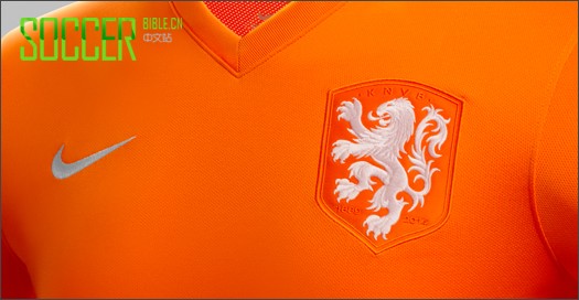
Nike have celebrated the 125th anniversary of the founding of the KNVB (Royal Dutch Football Association) with the launch of their 2014 World Cup home kit featuring a striking new crest. An enlarged white lion symbolizes a new era in Dutch football and the team’s core values of simplicity, honor and unity.
Unsurprisingly the new Dutch jersey is in traditional orange and sports a modern V-neck collar, providing a classic and clean canvas on which to showcase the new crest. Beneath the crest is the Royal Dutch Football Association’s founding year of 1889, along with 2014 to commemorate its 125th anniversary.
 |
 |
The lion has been used on Dutch kits since 1907. In the 1960s and '70s it was shown as large and free but in black, while in recent times only its head has been shown wearing a crown. For 2014 the re-designed lion is white and larger to represent the pride of Holland and the unity of their players.
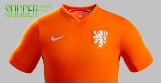
The itself design is fairly restrained but hides some nice design touches. Inside the cuff is a white trim which can be turned out to suit individual player preferences and inside the back of the neck is an orange pennant tab showcasing the crown that sits upon the lion’s head on the association’s own crest.
Nike also collaborated with legendary Dutch graphic designer and typographer Wim Crouwel to create new names and numbers. Crouwel created a modern font which also possesses a retro aesthetic with the lines inside the numbers being reminiscent of the numbers famously seen in football in the 1970s.
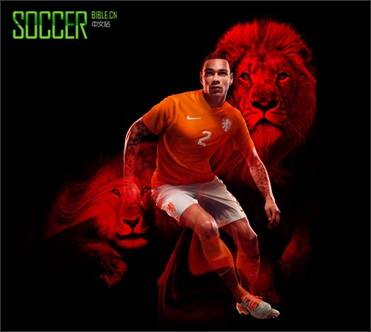
Dutch player Kevin Strootman, said: “The new 125th anniversary kit captures our unique football heritage perfectly, and the new Lion crest celebrates the pride we have as a team to pull on the jersey and represent our country.”
The new Holland World Cup home shirt will be available from selected online stockists including Pro-Direct Soccer. What do you think of the new design? Let us know. Join the conversation online, on Twitter and on Facebook.